I had to drop off a photo for someone today. I grabbed a standard number 10 envelope and scrawled the recipient’s name and then my name.
This ink even looks great on basic business envelope paper.


I had to drop off a photo for someone today. I grabbed a standard number 10 envelope and scrawled the recipient’s name and then my name.
This ink even looks great on basic business envelope paper.
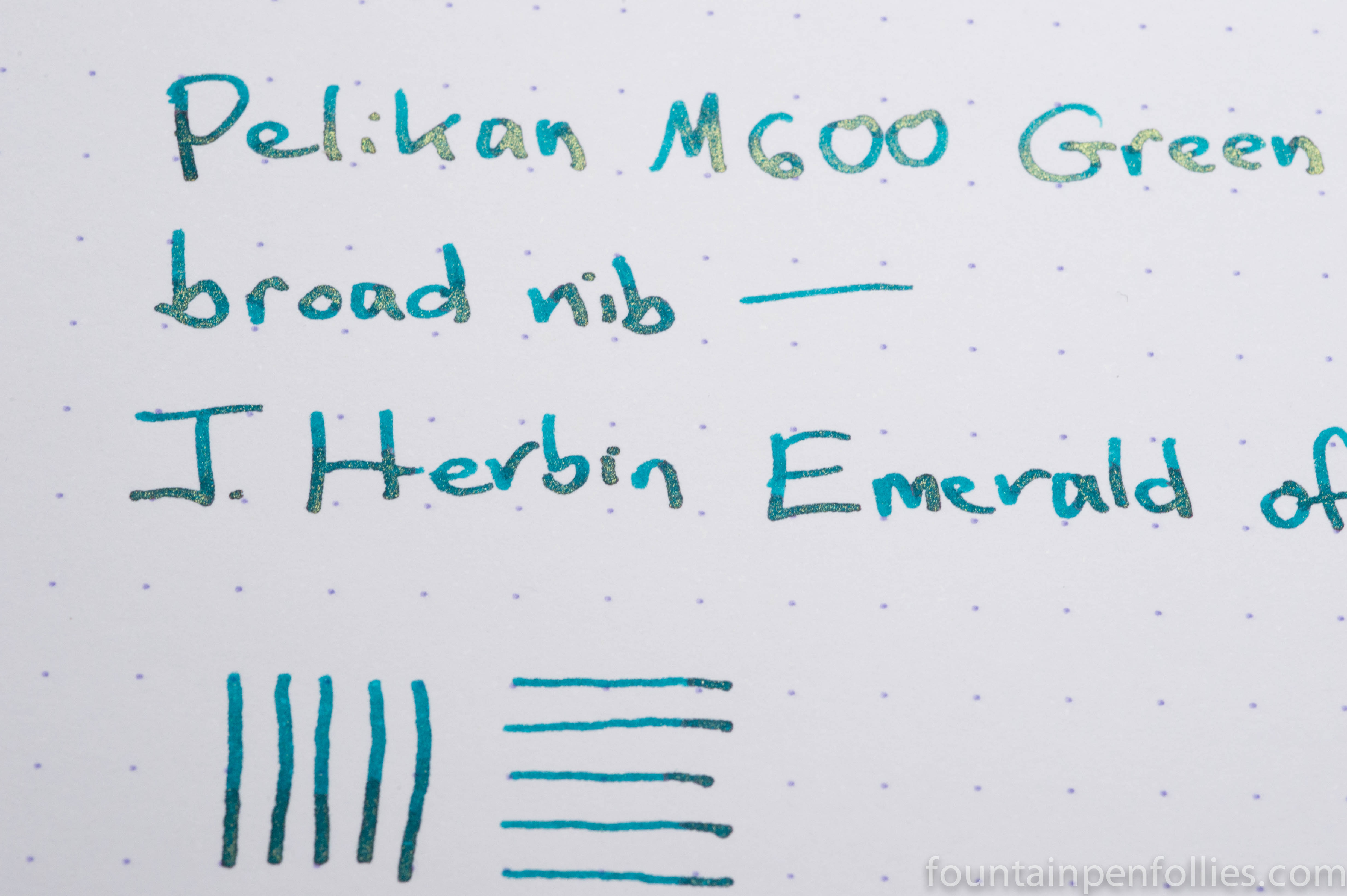
I have been playing with my sample of the new Emerald of Chivor. I had already pored over a great review, and I had even seen a writing sample in person, so I knew it looked spectacular. But writing with it has confirmed that this is really an awesome ink. As you can see in the photo above, the sheen and shimmer come through even with fine and extra-fine nibs.
(click Page 2 below to continue)

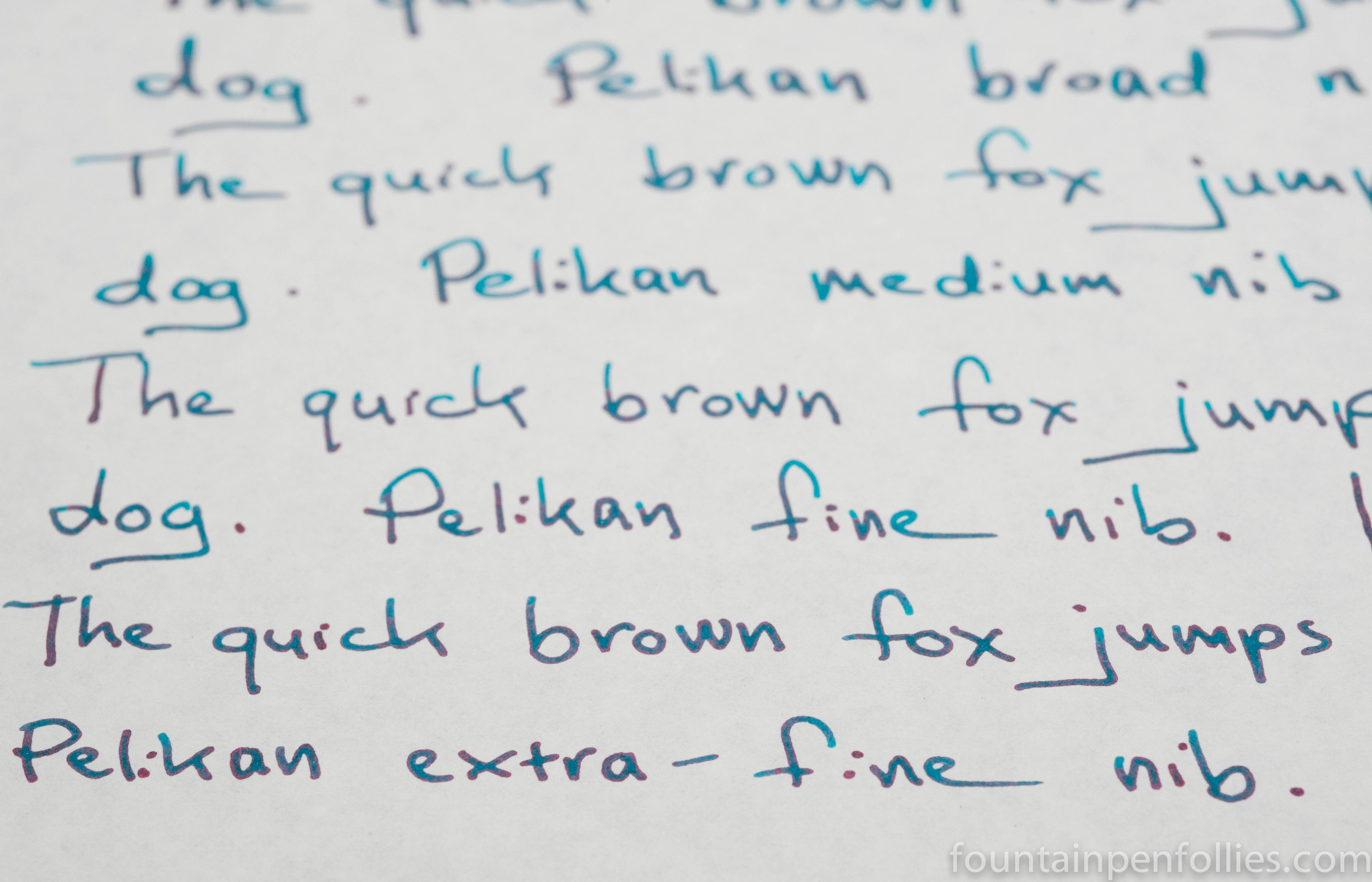
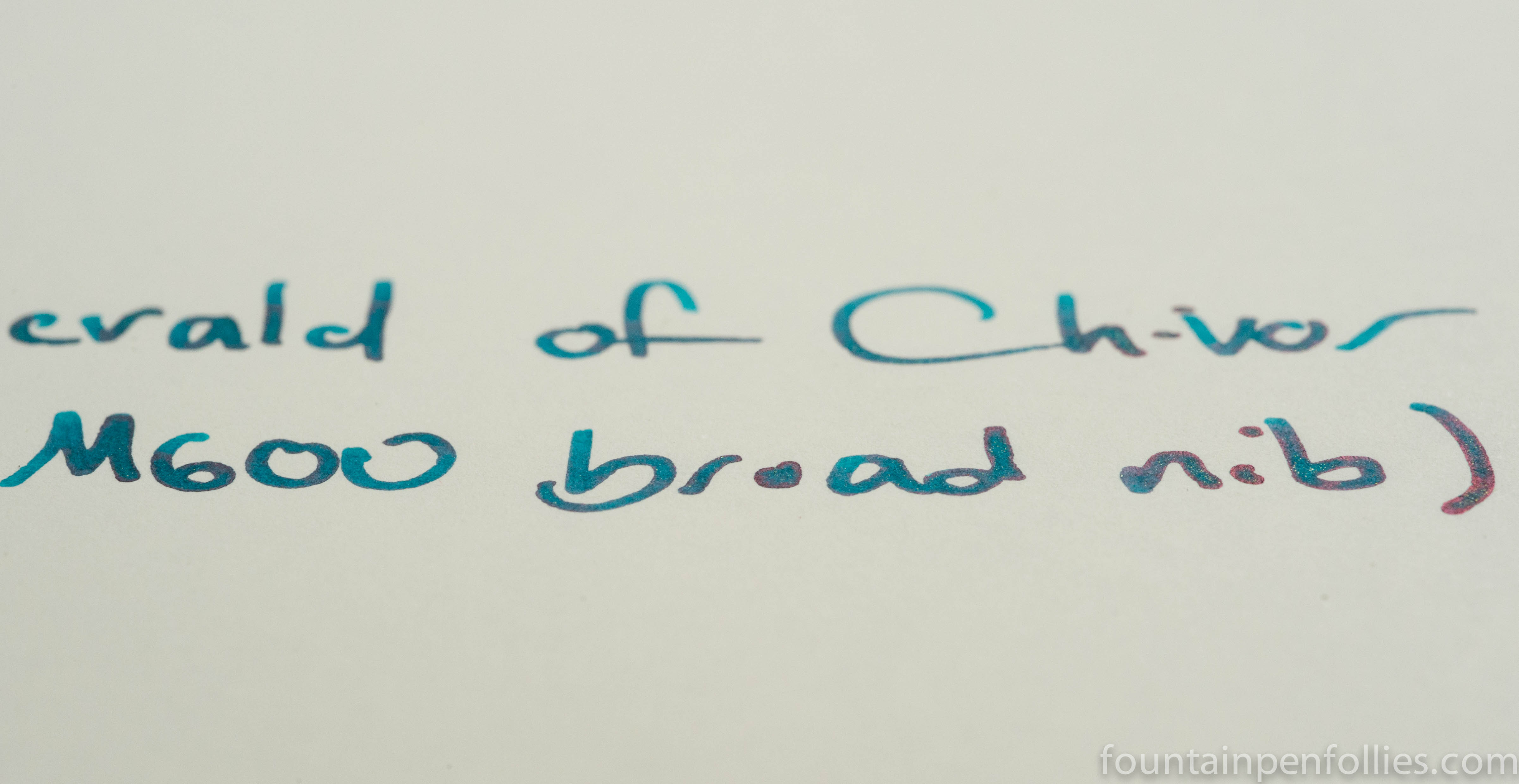
Pelikan M600 Green o’ Green with broad nib. A good friend sent me a sample of the new J. Herbin Emerald of Chivor, so I brought out my big gun, nib-wise. A Pelikan broad. That’s as big as things generally get for me. I’m more of an extra-fine person.
The pen is beautiful. But I’ll save that for another day, because the ink is new, and we have all been eagerly anticipating it. It’s a “wow” ink, it really is. A teal green, with gold flakes, that shades beautifully and sheens on the right paper.

On a Rhodia dot pad, the shading is gorgeous, and the gold flakes really stand out.
Tomoe River paper really brings out the phenomenal sheen.
In this photo, you can see that the period sheens so much it looks entirely red. That’s not a trick of angle or lighting, either; it looks like that in real life, in normal light and with the page entirely flat.

Plume145 asked whether there is any brown in J. Herbin Perle Noire. I did a quick bit of paper towel chromatography to see.

Yes! A khaki greenish, brownish hue, along with grays and blue.

J. Herbin Perle Noire. A standard black ink that has all the good qualities of Aurora Black plus more lubrication. Perle Noire seems to flow well in even the most dry pen, and is my favorite all-around black ink.
An everyday ink? Yes.
