
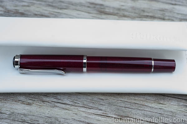
Right away, we are reassured that the M205 Star Ruby will not actually be very “out there.” It comes wrapped inside the regular, cushy white Pelikan wrap, tied with a ribbon of business-like dark brown.
Photographers will recognize that the photo up there is fully exposed, with the whites kept on the full, but not blown, side. That’s why you can make out the “Pelikan” embossed in the upper corner of the pen pillow. The pen is sitting in the shade of the wrap’s cover, but that’s really how the pen looks out of direct sunlight. The material looks translucent, and is an attractive dark red. I don’t really notice the sparkles unless I hold it up.
Now, below is the same photo, except overexposed.
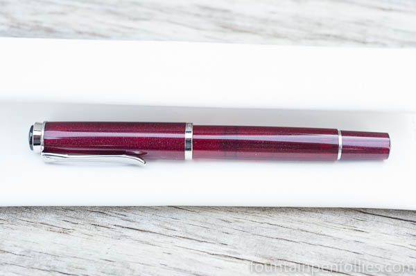
The whites are blown in this photo; you see no detail in the whites. But finally the Star Ruby material looks lighter and more transparent, and you see its sparkles.
That photo, minus the blown whites, is how I’ve seen the Star Ruby presented online. There isn’t any bad intent behind that, just people trying to see the material better. It’s like holding it up in sunlight.
The sparkles aren’t large, noticeable flakes, as in my Shooting Star of Jonuma; instead there is a multitude of tiny sparkles that look “baked in.” My friend Rick has a Sailor in a dark green with the exact same technique. I’d describe it as less showy but more rich-looking.
In the end, it’s not like a typical sparkly Sailor. It’s definitely not a punk rock pen. It’s just a nice-looking pen, dignified, suitable for work, suitable for your boss or grandparent. If you rotate it in the light, you’ll see the sparkles that are inside the red plastic. It’s attractive either way.
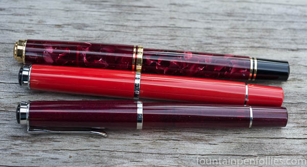
Comparisons are the best way to show its ruby red color. Here is the Star Ruby with M600 Ruby Red and M205 Red Pelikans.
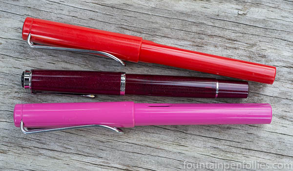
And here it is between the Red and Pink Lamy Safaris.
Here is the M205 Star Ruby with two Pelikans that are super fun, the M605 White Transparent and the M600 Pink.
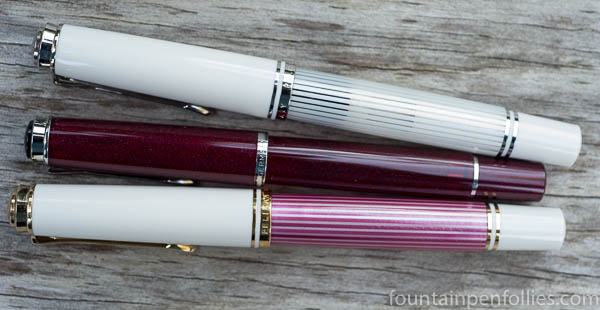
I really do love the silver trim, and in that photo I think the Star Ruby looks great with the M605 White Transparent, one of Pelikan’s unheralded gems.
But now comes the killer combination: here are my cool M205s, the Olivine, the Star Ruby and the Blue Transparent.
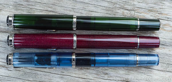
Just like the Olivine, the Star Ruby is darker and more dignified, but a great color. I like how each of these three have something special. The blue is transparent; the Olivine is extra dark and just barely translucent; and the Star Ruby has the sparkles, which you can see most on the cap there.
Is the Star Ruby what I expected? No. But it’s attractive in its own way, and I like it. I think I’ll always want to use it with those other two M205s now.

Oh, after seeing the reviews from you and Well-Appointed Desk…avoiding this lovely is becoming quite difficult. That’s one lovely bird. Which nib did you choose?
LikeLiked by 1 person
Medium. I like it as is, or it’s a great base for a narrow stub or architect grind. If you like bouncy nibs you might like the F or EF. The B is broad. The BB is really broad and designed as a highlighter but can be ground down of course. 😊
LikeLike
I love the dark ruby colour of this pen. I’m all for sparkles (have been writing a blog post this morning using a sparkly pink pen, in fact!), but as far as traditional colours go, I don’t think you can beat the Star Ruby. Your description of it as “dignified” is spot-on.
LikeLiked by 1 person
It is surprisingly traditional! That’s perfect. 🙂
LikeLiked by 1 person
Personally I much prefer the dark ruby red look in the correctly explosed photo, to the pink translucent look when over exposed. As you say, the silver trim works really well with this model.
LikeLiked by 2 people
I’m glad to hear that. While I would have preferred it to be pinker and wilder, myself, I like this one the way it is. And I do think it will be much more popular this way. 🙂
I also have to point out that in sunlight (or even just bright morning light) that pen would have looked lighter. It is a dark material, with sparkles, so it does change more than most depending on the light. You’ll even note a difference between the photos where the pen is in the shadow of the wrap, versus the ones where the pens are on the table.
And I should add that I’m not trying to imply that mine is “correctly” exposed in the sense that other people are “wrong.” These are just different choices. In the first two shots, I probably ended up underexposing the material by 1/3 to 1/2 of a stop to hold the whites, because the dynamic range of the sensor is not as wide what we see with our eyes and brain. Which is why the HDR look is so popular, except to me HDR looks fake. But that is what they do in product photos. Plus, many product images aren’t even photos so much as photo-based illustrations. And some pens are hard to photograph. So there’s still no substitute for seeing a pen in person. 🙂
LikeLike
This is another fine post for a quite basic reason: honesty. You simply tell people how you feel about a pen that arrives looking not exactly as expected. That’s a great service to your readers.
It does bring up an interesting point: this is not the first time in the last few years that I’ve seen the same… confusion over the look of a new Pelikan. The one that springs to mind is a model with a brown, granite-like binde but the cap and blind cap in a… dark blue. The issue was that almost every photo made the dark parts look completely different, and the people who started getting their pens were a bit put out that they didn’t look like, of all things, the photos from Pelikan. It would seem that the company should make every effort to show the pens as close as possible to their true look, including capturing them in different light.
Ah, buying pens. Such pleasure, such pain.
LikeLiked by 2 people
I always say it’s better to see a pen in person first. 😊 It’s more true for Pelikan and Sailor because their materials are so unusual and creative.
LikeLiked by 1 person
I just received an email today that mine will be shipped to me shortly. I’m glad I saw your write-up and photos, so my expectations will be a little more realistic. I think I’ll like it either way, whether in low light or direct sunlight. And I suspect that after more people see it in person, they’ll no longer be worried about it not looking professional or businesslike.
LikeLiked by 2 people
Agreed. It wasn’t what I expected, but i think a lot of people will like it more this way. And the deep ruby color is beautiful. I’m sure there are parallels that could be drawn to Dorothy’s ruby slippers in the Wizard of Oz. 🙂
LikeLiked by 1 person
Mine is sitting at the post office waiting for pickup but I’m glad to see it’s not as pink as shown in some photos. Great description! Can hardly wait to get it in my hands!
LikeLiked by 1 person
It’s a gorgeous shade of red. Can’t wait to hear what you think of it. 🙂
LikeLike
That is nothing like the other photo’s of this pen that have been doing the rounds! And coupled with your description, that’s a pen I think I might like–quite a lot. What a difference! Thanks for this!
LikeLiked by 2 people
…a lovely pen, depth of charsacter….Pink not quite make it, tho genuoine ruby wld.
LikeLiked by 1 person