
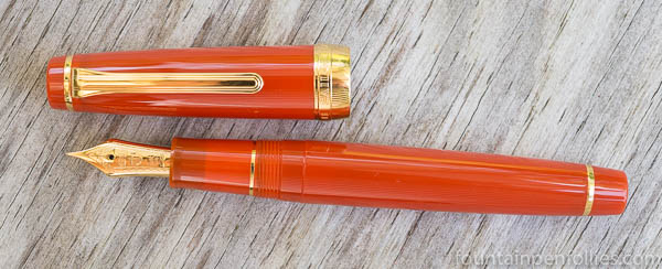
The new Sailor “Fire” Professional Gear special edition is aptly named: it’s “fire,” in the sense of “excellent.” I think it’s gorgeous.
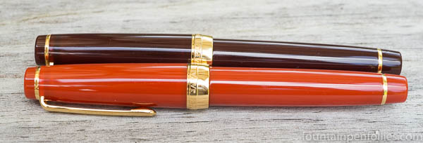
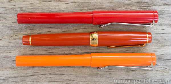
This is the fourth in a line that began with the Sky (transparent light blue), then continued with the Earth (translucent brown), and the Ocean (translucent blue-green). I’ve liked them all, very much, and I own an Earth. Here are the Fire and the Earth together.
Fire’s color is not standard red, and not orange, but definitely red-orange. I’d call it a mandarin red. It has the same translucence as the Ocean and Earth.
Dan Smith the Nibsmith sent me a full-size Professional Gear to review, because that’s my favorite size. The price of the full-size is $312. The pen is also available in slim (small) for $200 and King of Pens (large) for $816.
In real life, the Fire looks much nicer than it did in any Sailor photos I’ve seen online.
So here are some comparison photos. First is the Fire between my Earth and Kanreki Professional Gear pens.
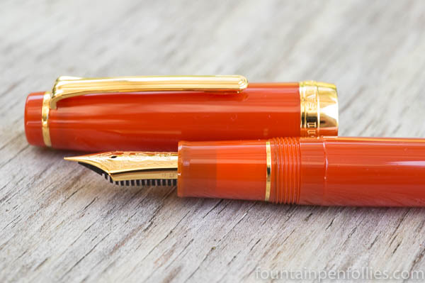
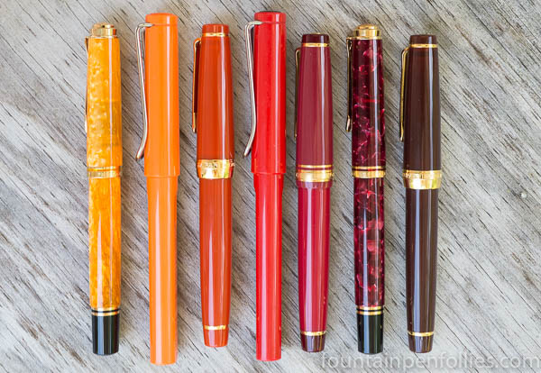
Now here is the Fire Professional Gear between two Lamy Safaris, which are standard, crayon-color examples of red and orange.
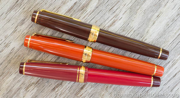
The big array: from the left, the Pelikan M600 Vibrant Orange, Safari in orange, Sailor Fire, Safari in red, Sailor Kanreki, Pelikan M600 Ruby Red, Sailor Earth.
Great color, great concept, great execution by Sailor.

I am commenting a little late on this thread, as I was researching the Sailor Fire. This new Sailor pen is very nice indeed and thank you for an interesting review.
I have the Sky and Earth pro gear, (among a large number of other Sailor pens). The Fire does look gorgeous. One odd feature, however, as far as I can tell from searching online, is that the Fire is not available in Medium Fine, which (IMHO) is one of the finest nib sizes Sailor produces- not so thin as to be lacking in “presence” but not too broad.
I am getting closer and closer to justifying to myself the need for yet another Sailor pen!
LikeLike
Now you’ve gone and done it – you put another “pretty” in the window, and I want it. However, I just bought a couple of Pelikans in red colors. I have the Ocean, though, and this would be a great partner for that pen…OK, I’m gonna finish this, post it, and quickly close out this page.
Maybe if this pen is still available in a couple of months…sigh…I’ll see what my “budget” (I use this term very loosely) looks like. 🙂
One quick question: have you ever bought a Sailor with a Music nib and then had it reground to a stub? I love stubs, and I’m wondering how that would work out.
LikeLiked by 1 person
1. I feel you because I would like both Fire and Ocean. And I just bought two red Pelikan M205s this summer….
2. I am sure the Fire going to be available for a while. I can still get the Ocean. Please don’t ask me how I know.
3. I have never stubbed a Sailor that, but I think it would be a good use for the music nib, which is already slightly stubby, has lots of tipping material and only got two tines. 🙂
LikeLike
Thanks so much for this! These comparison photos were exactly what I needed to make my mind up for me. The cats may have to stay on the cheap food for another couple of months 🙂
LikeLiked by 1 person
Thanks for throwing another temptation in my path! It looks like a good fit in the line-up. I’m on a self-imposed pen holiday at the moment, but I think I might have to add this to my ‘monkey see, monkey want’ list…
LikeLiked by 2 people
It is a beauty, I have to say.
LikeLiked by 2 people
Very helpful to see the colour comparisons in relation to more standard Safari red and orange. The Fire does look appealing although I am undecided on whether I prefer the Earth or Ocean. I own none of these.
LikeLiked by 2 people
I stood for a long while with the Earth in my left hand the Ocean in my right… the brown and gold won the day.
LikeLiked by 1 person
That would be me too, probably, if only there was a Sailor pen shop nearby. But I am also undecided as to which Sailor nib I would choose. I believe the technical term for this is being “all over the place.”
LikeLiked by 2 people
What would you say are some of your favorite brands and size of nibs now? Do you prefer silky smooth or a bit of feedback? If you were buying a pen on sale and the store only had fine or medium left, which would you pick?
LikeLiked by 2 people
What a truly sadistic question to ask a pen person! Love it!!!! 🤣🤣😂😂
LikeLiked by 2 people
I am going to have night sweats now about the pen sale scenario. Aaargh! Get both!
LikeLiked by 2 people
Good question. The truth is that I enjoy all different grades of nib, for different types of writing. For a long time I used to buy mostly medium nibs but I have since accumulated a fair number of fines and broads too. Some feedbacky nibs that I particularly enjoy are my modern Parker Duofold medium, an Aurora 88 “medium” which I would call a fine, and some lovely Kaweco steel nibs in fine and extra fine.
For silky smooth nibs, I love my Waterman Carene (a juicy medium) and some steel Visconti and Jowo nibs, and a Pilot 823. Lately I have discovered that broader stubby nibs are quite complimentary to my handwriting – such as a gorgeous soft broad nib on the Montblanc Heritage 1912 that I was given, so long as they are not so broad as fill in all my loops.
I suppose this all means that I could enjoy any of the Sailor nibs! The only one I have is a zoom at the moment, so I am lacking in the Sailor department.
LikeLiked by 1 person
No, Paul, I meant that kindly. 🙂 No sadism here. 🙂 I was going to offer an opinion — although it’s fair to say that people who know me well probably *do* consider that torture. 🤣
For example, if a person loves very smooth-writing Sheaffer medium nibs, I’d suggest trying a broad or music nib from Sailor. Whereas a person who loves vintage fine and extra-fine nibs, or modern Aurora fines, will probably adore Sailor fine nibs. 🙂
LikeLiked by 1 person
Honestly, my favorites are the Fire and the Ocean, but the one I own is the Earth. Why? Because I was lucky enough to buy mine from Dan Smith, who let me try two Sailors with extra-fine nibs; of those two, the Earth had the best extra-fine, an amazing extra-fine, so I went with that. And haven’t regretted it. 🙂 It’s possible that your Sailor best fit would be medium and up (maybe even a broad or music nib). The Aurora 88 nib is a good analogy. I hope you can see them in person.
LikeLike
Thank you so much for this. Your ProGear Earth EF sounds a real gem. I would love to be able to see the Sailor range and also dip a few nibs. We have John Hall’s shop ‘Write Here’ in the UK but it means making a journey to Shrewsbury, unless I catch him at a pen show!
LikeLiked by 1 person
I would totally swap finals and cap with a black pen on that one. Black and fire-red would be a killer combo. I like that in the last photo there appears to be some translucence in the material. Pro Gears are such fine pens… nice write-up.
LikeLiked by 1 person
*finials*
LikeLiked by 1 person
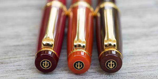
Thank you! The Fire, Ocean and Earth all have a translucence, which is most visible in the section but which you can also see in the cap if you hold it up to the light.
LikeLike