

Anyone who knows me knows I am a serious person. “Maturity” is my watchword and motto, perhaps even my raison d’être. You’ll note that I just slipped effortlessly into French there. Like me, the French are not-frivolous.
Thus, when Platinum named its latest fountain pen the Kumpoo, I did not go around whispering “Kumpooooooo” and then giggling. I did not immediately begin craving Kung Pao Tofu. I did not text my friend Dan the word “Kumpoo” followed by three or four 🤣 emoji in a row.
No, I did not. I said something mature and serious like, “I looked that up, and it means ‘balmy breeze,’ which is an apt name, because the color makes me think of a balmy breeze by the glinting turquoise sea. In my spiritual home, France.”
Because I am an adult. The rest of you disappoint me.
And now it turns out, I really like the Kumpoo. Not (only) because of its name. It turns out to be a nifty, and surprisingly nice-looking pen. How do I know this? My friend Dan, of “Dan Smith, the Nibsmith,” sent me his last Kumpoo to play with. I have to send it back, though, because he’s keeping it for himself. And he’s all sold out. Pooh.
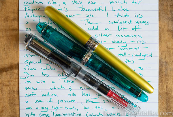
Platinum has limited the Kumpoo to 2,500 pens, available with three nibs only: UEF (ultra-extra-fine), F (fine) and SM (soft medium). Apparently the UEF were only available in very small numbers, especially in the US, and are already sold out. This particular Kumpoo has a soft medium nib on it, which actually is great with me, because I’ve never used one. Platinum lists the SM nib as an “overseas exclusive,” so presumably it’s not available in Japan.
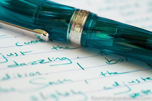
I inked the Kumpoo with Papier Plume Lake Michigan Summer, which is the perfect color.
I like the soft medium nib. It’s a Japanese medium, so not super wide. It’s soft and springy. It is not a flex nib — with light pressure you can spread the tines wider, but you won’t get the controlled line variation of a flex nib. It’s just kind of bouncy, in a pleasant way.
I should say this isn’t a stock soft medium nib: Dan modified it by creating a very slight gap between the tines so it would immediately start writing with a light touch. At my pen club meeting we compared this modified SM with a Kumpoo with a stock SM, and Dan’s modification really makes a difference for someone like me who writes with light pressure.
I found the SM nib fun to use. For everyday writing, it’s going to be better for someone else. I’m a person who likes to write very quickly, and messily, so I prefer a normal, or “hard,” nib which flies across the paper. People who like a springy nib, or who tend to write more slowly, or with a lot of pressure, or who want a wetter ink flow, would love the SM nib. I actually think the Platinum soft fine (SF nib) is very good, since there’s less of it, and that’s a stock nib for Platinum.

In some ways the SM nib is similar to the Pelikan M200 nib, which is a sort of bouncy steel nib. The Platinum Century SM nib is miles ahead of that nib, however. Now, the Platinum Century SM nib is a 14k gold nib, and the Kumpoo pen costs about $260. So you might say, woah there, apples to oranges. And that is fair. Still, I’d much rather have the Kumpoo than the M200, and not just for the nib. I like the pen a lot better, too.
The Kumpoo is a great size pen, the sort of size that would work for most people. A bit longer than the full-size Sailor Professional Gear, a bit shorter than the Lamy Safari, and wider and longer than the Pelikan M200. The Kumpoo’s balance and weight are good, too. The Kumpoo weighs 25.6 grams capped and filled (comparable to the Pro Gear), and 14.4 grams body only. The body only is a touch light: the full-size Pro Gear weighs about 2 grams more, which for me makes the Pro Gear more comfortable when writing unposted. But I could write with either for long periods of time.
Here’s a photo of the Kumpoo, comparing the size to the Platinum Plaisir and the Lamy Vista.
One nice thing about the Kumpoo is the wavy ridges in the pen body and cap. From marketing photos, I wasn’t sure if I’d like that, but in person, it totally works. It elevates the look over the standard #3776 Century. The color is nice, too.
Now Dan waxed poetically (for Dan) about the light reflecting off those ridges like the facets of a diamond or something. Unfortunately, it’s been rainy or overcast every day here, and marijuana is not legal in Illinois, so I can’t attest to the sort of bedazzling effect that it may have for others. I guess there is a nice glint occasionally but for me it seems to come from the silvery bits inside — the converter and the rhodium nib. With or without mystical gleams of light, however, it’s a very attractive pen.
I’m not even a big fan of teal or turquoise or aquamarine, but I like this one. And it’s the color of the summer, I’ll wager, after also having the privilege to use the Sailor Professional Gear Ocean.
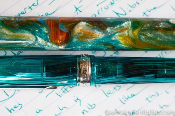
Comparing the Kumpoo and the Ocean is apples to apples, but different apples. The colors are in the same general teal-turquoise family, but the look is very different. The Ocean is darker, greener and more subdued; the Kumpoo is lighter, bluer and shinier. Also the Kumpoo is clear. The Ocean is the one you’d bring to the office; the Kumpoo is the one your teenage daughter wants to steal.
I’ve asked myself, if I could buy one, and only one, which? And it’s not easy, since I like them both. I really think Kumpoo looks great. Plus, since it’s almost sold out everywhere, you don’t get much more time to decide.
And then, I mean, it’s the Kumpoooooooo.
(To others, of course.)
But … I still think … I’d pick the Sailor. First, for the nibs. I just prefer Sailor nibs. And the Ocean can be purchased with any of Sailor’s standard nibs (which technically Platinum doesn’t let dealers do for the Kumpoo). Also, I just think the Ocean is more classic and will wear better in the long run for me. (Unless this is your color. In which case, buy both.)
I have to confess something: since my borrowed Ocean set sail back to Dan, I’ve missed it a bit. And that’s unusual for me, since I don’t really care that much about fountain pens.
Well, maybe one or two. For instance, here’s my Kanilea Hanauma Bay next to the Kumpoo. Because they looked so nice together. And because even if I can’t get every single pen I like, I’m happy to remember I already have some really great ones.

I just got so Lucky that I just FoU d this pen in a pen shop in Stockholm! And they had enouch pens to let me choose the serial number I liked best😉!So it might be something to ask around smaller shops for it?
LikeLiked by 1 person
It’s so beautiful! I wish I could have bought one but I already have the Shungyo. 😦 Teal pens are my weakness, the color is gorgeous.
LikeLiked by 1 person
It really is beautiful. I think it may have been a mistake to make such a relatively small number of these. Maybe they’ll bring the color out again, with a different body style.
LikeLiked by 1 person
Nice write-up. I caved completely on this and jumped on the bandwagon as soon as I could. The only choice we had in the UK was the soft medium and I totally agree with you on how it writes – plenty of bounce and only limited line variation. Compared to my bog standard 3776 in black, the Kumpoo is way nicer.
(Un)fortunately, my kids are of an age where poo and fart gags are de rigeur, so I’m afraid it will be a long time before I can think of the Kumpoo in terms of balmy breezes. In the meantime I’ll just have to settle for puerile sniggering. 😂😂
LikeLiked by 3 people
At least the kids won’t make jokes about the SM nib. Did I mention that I was tempted to go with a grey ink for the Kumpoo? The only problem was choosing which one, since I have around 50 shades.
LikeLiked by 2 people
I see what you did there…😀👏
LikeLiked by 2 people
And it even comes with ridges.
LikeLiked by 1 person
😁🙇🏻♀️
LikeLiked by 1 person
I purchase many of my pens from Dan Smith but unfortunately was too slow on the Kumpoo and ended up having to get it elsewhere – wanted to have the second pen in the Fuji Shunkei series. I too have it in a SM nib which I’m hoping I’ll like better than the SF I have in the Shungyo. Either way though, both are very nice looking pens, but I particularly like the way the ridges work. Now I just have to decide which ink matches best …
LikeLiked by 1 person
I like the ridges, too! From both the form and function standpoint. I’m interested in hearing what you think of the soft medium nib when you try it. Karl at my pen club seems to like his.
LikeLike
The pen is gorgeous. I love the color. I never heard of this pen, until your blog about it. I’d love to have one. I am a big teal and turquoise fan. It would go well with many of my inks!
LikeLiked by 1 person
It is gorgeous! I hope you can get one!
LikeLike
That isn’t going to happen, sadly. No funds. But that color really does it for me. It is simply outstanding to me.
LikeLiked by 1 person
Me either! And, me too! But it’s fun to see it. 🙂
LikeLike
A great read, thank you. Very useful to have a comparison with the Sailor Pro Gear Ocean, which appeared on my radar recently. I have not seen either of them in the flesh. But I am guessing that the Kumpoo (giggle) soft nib might be similar to my Pilot Custom 74 and Custom Heritage 92 gold nibs. And since I have these, I am resisting both. Now, that’s maturity😁.
LikeLiked by 1 person
As a very mature person myself, I agree completely.
LikeLiked by 1 person
Beautiful pictures and great review, although I don’t think they do the Pooh (or Kanilea) justice.
Gonna keep working on the wife for the Kanilea…we did honeymoon there, after all…
LikeLiked by 1 person
I mean, it makes perfect sense when you put it like that.
LikeLike
And I was doing such a great job of not seriously thinking about buying this pen until I read this review.
“And because even if I can’t get every single pen I like, I’m happy to remember I already have some really great ones.” I keep telling myself that, and then I think but what would that be like with a soft fine? I haven’t got a soft fine… and so on.
I would be lying if I said you haven’t thrown temptation in the air like a summer kumpoo.
LikeLiked by 2 people
Better Kumpoo quickly then, because they are scarce. 🙂
LikeLiked by 1 person
Nice review. Bonus points for the use of “Pooh” and sub-scripting “(only)”. it’s the little things that count. I like the swirls on this pen, but I’m not a turquoise kind of person. I do love the SM nibs, however. All in all, another lovely 3776.
LikeLiked by 1 person
I’m not a turquoise person either…. It creeps up on you. First you think, hmm, that Pelikan Edelstein Aquamarine ink doesn’t send me screaming from the room. Then you like Papier Plume Lake Michigan Summer, and use it. A lot. Then you find yourself singing “I’ll Be Missing You” to the Professional Gear Ocean. Then one day … the sparkly stylings of the Platinum Kumpoo appear in your pen case. And you realize. You have changed.
LikeLiked by 4 people