
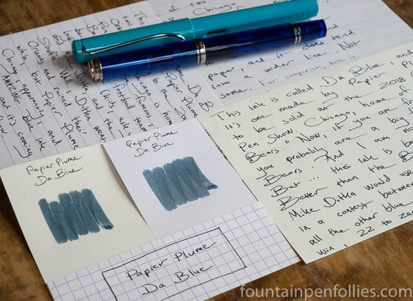
Papier Plume Da Blue. This is a gray-leaning blue-black ink, with an itsy bitsy hint of green. Da Blue ink pays tribute to the Chicago Bears football team, and is one of two limited-edition inks that Papier Plume of New Orleans is bringing to the Chicago Pen Show next month.
(click Page 2 below to continue)
Pages: 1 2

Thanks for the review!
I wonder how it would fare compared with Kyo No-Oto #05 Aonibi that I happen to have. Aonibi is also a kind of subdued blue-black, bluer than Pelikan 4001 Blue-Black and a tiny bit more grey than Diamine Denim.
LikeLiked by 1 person
You’re welcome! Thanks for the comment!
I’ve never tried Aonibi, but it’s supposed to be in the Chicago Pen Show Ink Testing Station, so …. Until then, I wonder if Aonibi looks similar to Shikiori Shimoyo, which is in one of the swab comparisons here. Shimoyo and Da Blue look fairly similar, especially in the pens with EF nibs — but Da Blue adds that teensy bit of green.
I want to emphasize “teeny” when it comes to the greenish tint. Sometimes when I use a blue-black that’s excessively green, like Quink Blue Black, I’ll need to mix in a little red to pull it back, make it more blue. I’ll never want to do that with Da Blue, because Da Blue is attractive, and crisp on the page, just as it is.
LikeLike
Who knew? Go Bears!
LikeLiked by 1 person
It is a rare color, and I love to read a review with a bit of additional info’ or story to it, these have been great.
LikeLiked by 2 people
Thanks for the great review and helpful comparisons and a lesson in Da Bears. This sounds like another must have ink for Chicagoan fountain pen enthusiasts, of which you are probably a suitable cheerleader. (Think of some chants, involving pens and inks…) “Two Four Six Eight, Cheaper inks evaporate.”
LikeLiked by 1 person
Nice colour. I’ve just inked my Platinum 3776 with R&K Verdigris and can see some superficial similarities in the colour (definitely no sheen with the Verdigris though).
LikeLiked by 1 person
That’s a great comparison, thank you! I want to check into that, now! I wish I knew more about Verdigris — I’ve only sampled it at our Ink Testing Station.
Since we’re talking R&K, if I may geek out a bit…. The R&K Da Blue reminded me of is a special edition from some years back called Blau Schwarz, which I’ve always loved. But I didn’t want to put Blau Schwarz in the comparison because it’s not available any more. There’s also R&K Blau Permanent…. And so many good inks from R&K, but they are a little under the radar, like J. Herbin.
Well, I hope Papier Plume is getting a little more attention, at least. 🙂 And, yes, the sheen on Da Blue is so nice. Da Blue is a very beautiful ink, if you like inks this color. 🙂
LikeLiked by 1 person
I’m only just starting out with Verdigris myself. I had a sample for ages and did nothing with it, but I eventually tried it and liked it enough to take a punt on a bottle. It’s a bit of a complicated, moody ink, but I’m enjoying getting to grips with it.
I suspect Blau Schwarz came and went before I’d even heard of R&K, but it sounds intriguing! 😀
LikeLiked by 1 person
now, that’s a color I rarely see in a ink, with all these hues, and I like it !!
LikeLiked by 2 people
Me too!
LikeLike