
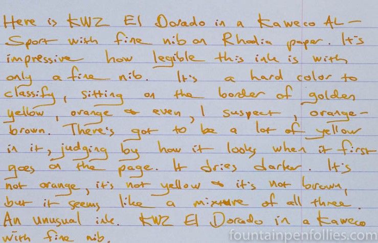
I didn’t have a large enough ink sample to try KWZ El Dorado in two pens, so I decided to use it in a Kaweco AL-Sport with a fine nib, because a pen with a fine nib is the toughest test for a light-colored ink.
But not for this ink. El Dorado is a light-colored ink, but it has enough oomph to be legible even with a narrow nib. As a fine-nib fan, I love that, and I don’t see that very often with lighter inks. To take one recent comparable ink, I found I need to use Montblanc Golden Yellow in a broader nib if I want to be able to read it easily.
But KWZ El Dorado did fine with a fine. Here is a writing sample on Rhodia paper.
El Dorado is not a bright-colored, or glaring, golden color. It’s darker and more subtle than most yellow or yellow-orange or gold inks. Its shading is apparent, but smooth, not showy or jarring.
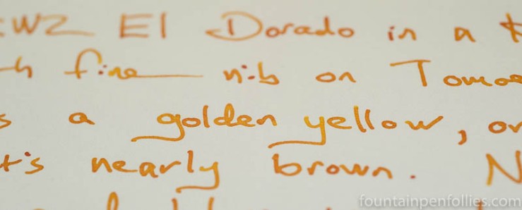
Here is a closeup on Tomoe River paper.
Performance was good for me: El Dorado is a wetter ink with good lubrication and flow. I got no showthrough or bleedthrough. It feathered a bit, but only on the worst-quality paper.
On my everyday Staples Sustainable Earth legal pad paper, El Dorado was very feather-resistant. Here’s an extreme closeup.

As you’d expect of a yellow-ish ink, El Dorado is not particularly water-resistant, either on absorbent regular paper or on fountain-pen friendly Rhodia.
But it cleaned out of the pen easily.
What really interests me about El Dorado is the color. The color is easy to capture in photos, but hard to classify.
El Dorado is primarily golden yellow, but it seems darker, or almost golden brown. And sometimes I saw it as a slightly orange yellow. But it’s not exactly yellow, not orange and not brown. I’ve settled for calling the color “gold” or “golden.”
Here are some comparisons. First is El Dorado with two of my lighter, most yellowy, orange inks.
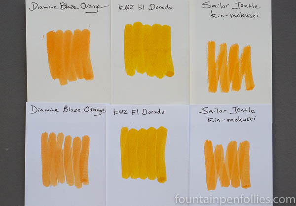
El Dorado doesn’t look orange there.
El Dorado did not really match the inks I’d imagined might be similar.

When looking at that array, you can see how nicely saturated El Dorado is, which no doubt contributes to its excellent legibility.
You can also see how different El Dorado is. The three “Amber” inks are variations on a theme; closest to El Dorado is the great J. Herbin ink Ambre de Birmanie, but the J. Herbin ink is browner and less gold. On the other end of the scale, Montblanc Golden Yellow is a happy and warm yellow that doesn’t fit in with the ambers.
El Dorado just looks more gold in that company.
And here is El Dorado in the middle of the other KWZ browns (or green browns or golden browns) that I’ve been using — or in the case of KWZ Cappucino, will use in the future.
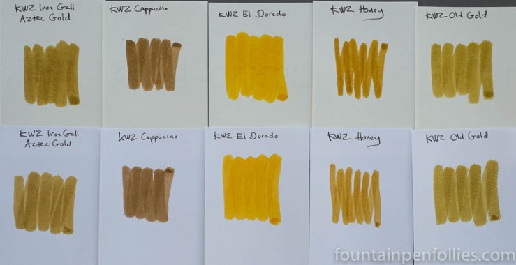
Again, when contrasted to other inks, El Dorado seems golden.
So there we are. As per the ink’s name, I’ve ended up thinking of El Dorado as essentially golden.
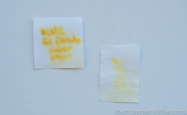
But that still left me a little unsatisfied, so yesterday I decided to do paper towel chromatography. And here it is.
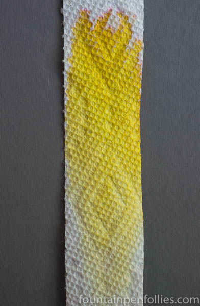
Do you see that tiny bit of dye way at the top? Pink. Specifically a light pink or peach pink.
Which accounts for the slight orange-not-orange impression I’ve been getting. It’s a very interesting mixture, using the tiniest amount of pink, to make the legible golden color that is KWZ El Dorado.

KWZ hit the mark with this ink- bright and legible in fine nibs, interesting and hard to pin point, and that completely arbitrary category- a happy ink.
Thanks for really showing us how special an ink KWZ Gold is in comparison to so many other inks!
LikeLiked by 1 person
Oooh. I do love legible yellows!
LikeLiked by 2 people
Another excellent ink review. This looks like a nice ink to try out in the future. The comparisons seal the deal for me.
LikeLiked by 2 people
KWZ has my total awe. Their inks are fantastic !
LikeLiked by 3 people
I feel exactly the same way. Awe.
LikeLiked by 1 person