

I pounced on a bottle of Lamy Petrol ink, to make sure we had one for the Chicago Pen Show Ink Testing Station. And I really like it.
I put the ink in the Safari with a fine nib, and you can see the results. It’s a very dark green, with a blue tint. There’s a bit of shading. I’m thinking a Safari with a wider nib would show more shading, and maybe even lighten the color. On the other hand, using a wetter pen would darken it.
I don’t think Petrol is going to be a huge sheener. But the color is excellent, very dark and extremely legible. I don’t think it’s a “muddy” green, to borrow my friend Rick’s phrase. It’s a clear color, just dark. It’s going to be a great ink for work. It’s a “near black” ink.
I was filling pens for the Ink Testing Station, so I grabbed Pelikan Edelstein Aquamarine and Pelikan 4001 Dark Green to compare. (I was in the “P”s.)
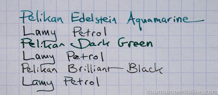
Look how much darker Petrol is than Aquamarine or Dark Green there.
The ink Petrol reminded me of is Sailor Four Seasons Miruai.
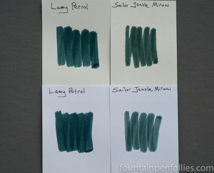
I love Miruai. But Lamy Petrol is darker, and it’s bluer, and cheaper, and I have to say that I like Petrol even more. I’m definitely picking up a second bottle.
I’ll have to see how easily Petrol cleans out of a pen, but I sure love how it looks. I know a few other people have gotten it recently, too. What does everyone else think?

I’m thinking about picking up a pack of Lamy Petrol cartridges for my new Vista. I *really* like the way the Petrol Safari looks, but since I just purchased a Vista, can I justify buying a Safari? The struggle is real.
LikeLiked by 1 person
The answer is always … yes!
Whatever the question. 🙂
LikeLike
I like this pen, but I may actually pass on the ink. I’m enjoying the deAtramentis Petrol that I have in there right now. But then again, I’m an ink addict so I’ll probably end up getting a bottle.
LikeLiked by 1 person
I almost passed on the pen. But I got it for the collection, as my friend Plume says. 😁
LikeLiked by 1 person
It’s good to have a collection! 😁
LikeLiked by 1 person
Mine came on Saturday and was promptly loaded into a wet-writing Pelikan M200 with broad nib. It’s true that it might be mistaken for black at a distance, but it’s still discernibly teal to me. What’s more, it does sheen, in a nice “red outline to the letters” sort of way.
LikeLiked by 2 people
Are you getting sheen like Dark Lilac? I guess I’ll have to try a wider nib. 🙂 it was not very popular at my Sunday meetup, but I sure like it. 🙂
LikeLiked by 1 person
Great note. I too like the look of this ink. I haven’t written much with it, but the colour is really interesting. The balance of the blue and green is intriguing and not quite like anything else I’ve tried. My closest match-up was Noodler’s Squeteague, but like Sailor Miruai it lacks enough blue to get close enough to the Lamy ink. As I’ve mentioned elsewhere I quite like the colour of the matching Safari, it’s the matte finish I’m not such a fan of.
LikeLiked by 3 people
Yeah, I agree, on all points.
LikeLiked by 1 person
I love Noodler´s Squeteague. And I tought Petrol would very similar. But I am affraid of being to dark for me.
LikeLiked by 2 people
I love Squeteague as well, although I have so many other inks to work through that it hasn’t been in my rotation for a while. The Petrol is definitely darker than Squeteague when it comes to the written word. It also has more blue in it compared to Squeteague. If you own a Safari, it might be worth trying some Petrol cartridges as they are relatively inexpensive. In the UK currently, that’s pretty much the only option as the bottled ink is sold out.
LikeLiked by 1 person
I am glad that you like it too. I am thrilled with mine. I got the Petrol Safari with a box of the matching cartridges. (I have not seen the bottled ink for sale in the shops yet). I enjoy the ink colour a lot. The best way I can describe it is dark teal. The closest that I had to it before was Noodlers Sequioa which I would call green black. Petrol shades nicely with the Safari medium nib. I do not see any sheen though, at least not on the white paper that I have tried so far.
The Petrol Safari really is close match to the ink colour.
LikeLiked by 3 people
I wonder how close it is to Akkerman-Zuiderpark Blauw Groen? I already have that, and don’t want to get something too close to what I already have. I also have Sailor-Miruai too. I also have Franklin-Christoph Midnight Emerald.
LikeLiked by 3 people
Unfortunately I do not have any of those. Petrol was unlike anything I had seen before and gave very pleasing shading on my white paper test pad. I suppose this is why I took to it instantly. With the Petrol Safari it is very matchy matchy😊
LikeLiked by 3 people
I have a feeling it may be close to the Akkerman ink, but darker than the Midnight Emerald. I was hoping someone might confirm…lol. If I can get some I will, unless I hear it is close to something I already have.
LikeLiked by 3 people
It’s really not close to that Akkerman ink. That comparison photo is color-balanced and accurate. One’s primary impression looking at it on white paper is “dark green, or is it maybe black?” It’s dark like the “Deep Dark” series that Diamine makes for Cultpens. However, it is a bluer green than the Deep Dark Green from Cultpens.
It’s funny but photos online have a hard time capturing the color of the Petrol Safari, with is greener and darker in real life than it appears in most photos I see. As Rupert says, the color of the ink is really very close to the color of the pen.
LikeLiked by 2 people
I haven’t tried any of the Deep Dark inks by Cult Pens. Thanks for the comments. I forgot to mention I have Deep Sea, but I doubt if that is close. So I will try to get a bottle of this Petrol. I even toyed with the idea of the pen too. That is how much I like the blue green stuff…lol.
LikeLiked by 2 people
They’ll have samples, too, at Vanness and Anderson and Goulet as soon as the first wave passes
LikeLiked by 1 person
Thanks for your thoughts Laura on this color. This is the one color of Safari that I am actually tempted to get. I already have plenty of workhorse pens. But I do love the color. I don’t know about the ink, whether I would like it or not. Odds are I would like it. I might even love it.
LikeLiked by 4 people
I’m still undecided. Doesn’t quite do it for me, but at $10 I might pick up. I’ve seen some shots with a red sheen, so that is intriguing. The Safari I love. FOMO might win out.
LikeLiked by 2 people
I have mine in a Safari with a fine nib, which we could pretty much call “the anti sheen machine.” I just don’t think it will prove as sheeny as Dark Lilac was, or many Sailor inks are. In part it’s because it’s so dark the sheen is harder to perceive. But I do get some sheen writing on Tomoe River paper, and when I paint the ink on Tomoe River paper, I can bring out much more. By saying it’s probably not a huge sheener, I meant, sheen isn’t the most noticeable characteristic.
Don’t hate me, but I’ll admit that I love the ink, but stand in the lonely and unpopular position of not liking the color on the pen. But vive la différence! And I’m happy the last two Safaris have been so popular. It’s nice when only a third of the pen population mocks your favorite pen, down from two-thirds a few years ago. 🙂
LikeLiked by 3 people