
Here’s something ink-related I found at the Art Institute of Chicago last week.
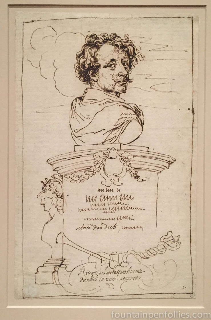
It’s a copy drawing from the late 17th Century of a print based on a Van Dyck print. The unknown artist drew this with iron gall ink, more than 300 years ago.
Here’s a closer look, just because I think this part is so well done. Also because it shows that the ink is now brown.

I’m going to admit that my fourth or fifth thought upon looking at this was: I hope KWZ makes an iron gall ink in this color. I think I have ink on the brain.

Right, got it now! In fact I realize now that you had explained this in the post, I just missed it 😛 Essentially this is a copy of a copy of the original – it’s twice removed from the original. It’s great to see the other two and compare! They are surprisingly different for essentially having the same basic form 😛
LikeLiked by 1 person
It’s complicated, and I probably can’t explain it well, but this is a copy drawing of a secondary print that was based on a Van Dyck self-portrait from The Iconography.
Van Dyck, along with others, made a set of prints in the early 17th Century of not just prominent historical figures and wealthy people, but also of artists. Notably, in doing so Van Dyck put artists on par with figures like the Pope. And his prints are entrancing and, dare I say, modern. Here is Van Dyck’s stunning self-portrait print: http://www.metmuseum.org/art/collection/search/337062
That original Van Dyck print was later filled out by Jacob Neefs into a more formal and conventional print, where it become a bust, with writing: https://commons.wikimedia.org/wiki/File:Van_Dyck_Self-Portrait_from_Iconography.jpg
It was the Neefs print which this unknown Italian drew with ink on paper. Maybe he or she omitted the bulk of the Neefs’s additions because of time. But maybe also because the Van Dyck part was the sublime part?
LikeLike
I like how the dedication on the pedestal is just scribbles 🙂 I wonder if it was like that on the original print or if the writing was whole but the copier just didn’t take it down. And WHY! Did it not matter, did they not have time, was it hard to see? So curious! Thanks for this, it’s great 🙂
LikeLiked by 1 person
That is very cool!
LikeLiked by 1 person