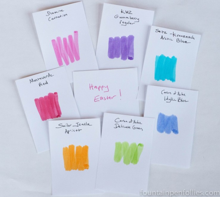
oooh, Sailor Jentle Apricot! One of my favorite inks ever 😛 When it shades it reminds me of a juicy orange! I just love the whole bouquet, such a beautiful palette! Happy Easter 🙂
Yes, those are so pretty in a “I’m going to dye my eggs this color!” way, but… with inks like “Delicate Green”, how could you ever use it to *write* with? It would be nearly impossible to read an entire letter that had been written with a light, bright ink like that. This is the point that I say “pretty ink, not going into the collection”. What am I missing?
I totally see your point, because “light” or “pastel” is the governing theme here. 🙂 I guess I tend to pick a pen to match with every ink anyway. And I think different people may see colors differently. For me, the Delicate Green is very legible; right now it’s in an Omas with extra-fine nib. But I have to use a wider nib with either Sailor Jentle Apricot or Seitz Kreuznach Arctic Blue.
I have a full bottle of exactly one of these inks, so they aren’t in heavy rotation even for me. 🙂 But the one that I have the full bottle of is … Caran d’Ache Delicate Green. ❤
We’re doing Easter this afternoon so it’s in the oven and it smells good. Should have taken a picture of the carrot cake, half came out of the bundt pan, half didnt. So I plastered it together with frosting, lol


oooh, Sailor Jentle Apricot! One of my favorite inks ever 😛 When it shades it reminds me of a juicy orange! I just love the whole bouquet, such a beautiful palette! Happy Easter 🙂
LikeLiked by 1 person
Yes, those are so pretty in a “I’m going to dye my eggs this color!” way, but… with inks like “Delicate Green”, how could you ever use it to *write* with? It would be nearly impossible to read an entire letter that had been written with a light, bright ink like that. This is the point that I say “pretty ink, not going into the collection”. What am I missing?
LikeLiked by 1 person
I totally see your point, because “light” or “pastel” is the governing theme here. 🙂 I guess I tend to pick a pen to match with every ink anyway. And I think different people may see colors differently. For me, the Delicate Green is very legible; right now it’s in an Omas with extra-fine nib. But I have to use a wider nib with either Sailor Jentle Apricot or Seitz Kreuznach Arctic Blue.
I have a full bottle of exactly one of these inks, so they aren’t in heavy rotation even for me. 🙂 But the one that I have the full bottle of is … Caran d’Ache Delicate Green. ❤
LikeLike
Happy Easter to you, as well. Kids are coming over this afternoon cause a couple have to work tomorrow..
LikeLiked by 1 person
I hope for an update on how the pineapple dish was!
LikeLiked by 1 person
We’re doing Easter this afternoon so it’s in the oven and it smells good. Should have taken a picture of the carrot cake, half came out of the bundt pan, half didnt. So I plastered it together with frosting, lol
LikeLiked by 1 person