
I know I mentioned a few weeks ago that a friend gave me a sample of my very first Bung Box ink, First Love Sapphire.
And I posted a writing sample from an Aurora Optima with a fine nib.
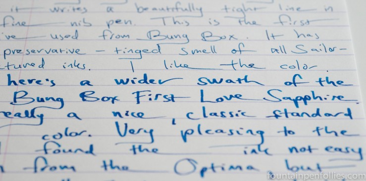
But here’s a quick look at Bung Box First Love Sapphire from both the Optima and a much different pen, a Kaweco Sport with 1.1 mm calligraphy nib.
I find it really interesting. The ink color is consistent, but the impression it makes, on me at least, is very different.

That’s good to hear. Because I think I like it more in the fine nib. 🙂
It is definitely not garish, but it manages to be fun. I like that.
LikeLike
perfect! I generally lean towards wider nibs, overall. Both for my own writing, and for other people’s writing. I don’t know why! It’s a bit toddler-ish, I guess – bright colors! bold lines! that kind of thing 😛 Your posts have taught me to appreciate fine(r) nibs more than I used to but I will still gravitate towards the wide ‘n’ juicy if left to my own devices.
LikeLiked by 1 person
I loved this ink last time I saw it, so it’s great to see it back. It gives me that same sense of cheerful bright open color, that somehow manages to not be garish at all. I still prefer it in the wider nib. Not that I don’t like it in the fine nib, just that the wider nib makes it *pop* for me more 🙂
LikeLiked by 1 person